
Building a new dashboard
Topics covered
- Adding a Group widget to the dashboard
- Setting up interactivity and master filtering
- Binding data to the widget
- Configuring widget options, captions, and search functionality
Adde and Configure a Group Widget
We’re now integrating the data source we created into a widget. By configuring the Interactivity settings, we ensure that filtering works seamlessly across multiple widgets. For this step, turn on the Master Filter option, which allows this widget to act as a central filter for others. More details on configuring interactivity will follow.
Step 1. Reveal the Dashboard Designer:
- Click the Close button to hide the main menu.
- This will expose the Dashboard Designer interface.

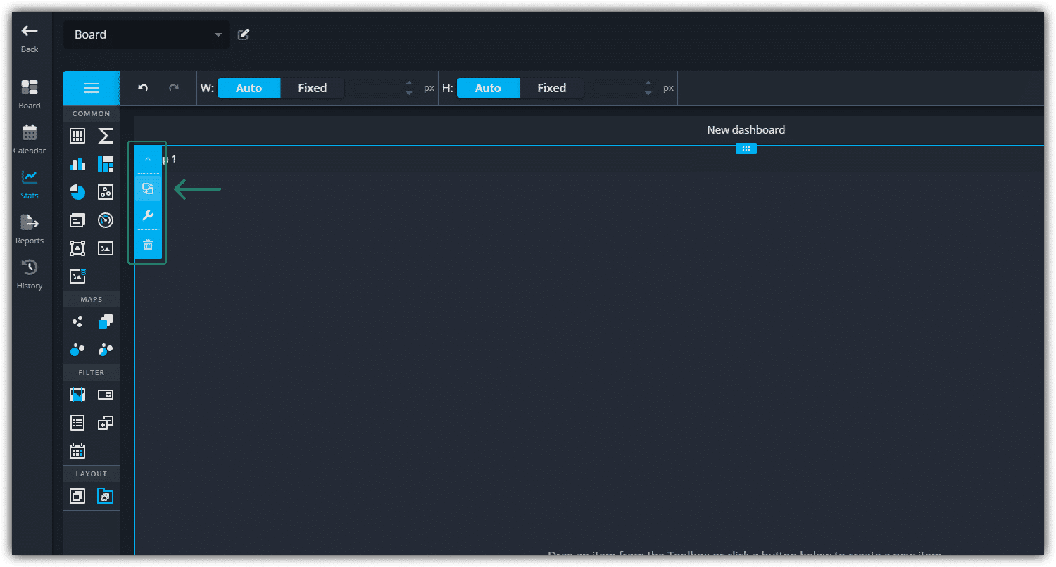
Step 2. Add a Group Widget:
On the left side, locate the Widget Toolbar.
- In the Layout section, click and drag the Group Widget onto the dashboard surface.
- This action adds the Group Widget to your dashboard.Value: ?BoardId

Access Widget Configuration Options:
- Use the toolbar that appears at the top of the widget to access configuration options.
- Click the Interactivity button to open its panel.
Configure Interactivity and Add a List Box
Steps to Configure the Group Widget:
1. Enable Master Filter
- In the Interactivity Panel, set the Master Filter option to ON.
- For more details about this feature, refer to the DevExpress Documentation on Master Filtering.

2. Set the Caption
- Click on the Options button in the widget toolbar.
- Update the Caption to Filters for clarity.
- Close the options.

3. Add the List Box Widget
- Drag the List Box Widget:
- Locate the List Box Widget in the Widget Toolbar.
- Drag and drop it inside the Group Widget.
💡 Important note: Ensure that the List Box Widget is placed inside the Group Widget. This step is critical for enabling proper filtering functionality across other widgets on the dashboard.

Binding the Widget to the Data Source
Now that we have set up the List Box widget, we need to bind it to the Categories data source we created earlier. This will allow the widget to pull in and display the relevant category data. Steps to Bind the List Box Widget:
1. Open the Binding Panel: Click on the Binding button to open the panel.

2. Select the Data Source:
- In the panel, click on the DATA SOURCE section to expand it.
- Since Categories is the only data source we've defined so far, it will be selected automatically.
- Click OK to confirm the data source.

3. Add a Dimension:
In the Dimensions property, click on Add Dimension to add a new dimension to the widget.

By following these steps, the List Box widget will now be connected to the Categories data source, allowing it to display the appropriate data and interact with the rest of the dashboard elements.
Binding and Configuring the Category List Box Widget
1. Bind the CategoryTitle as a Dimension
Click on the CategoryTitle field to add it as a dimension to the List Box widget. Once selected, CategoryTitle will appear as a dimension in the Binding panel, indicating that it is now bound to the List Box widget.

2. Configure Options and Interactivity
To configure the widget, start by expanding the Options section and setting the Caption to "Category."

After that, close the Binding Panel by clicking the Close button.

Next, enable Cross-Data-Source Filtering by opening the Interactivity panel and turning it ON. This ensures that any filter applied will affect all widgets across the dashboard. For further details on Master Filtering, you can refer to the DevExpress Master Filtering Documentation.

3. Enable search
Open the Options panel and turn Enable Search ON.

Categories are now visible.
💡 Make sure you apply your changes!
