Setting Up the Dashboard
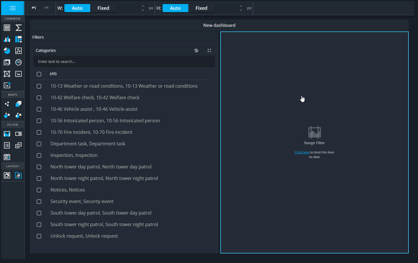
Add and Configure a Rang Filter
Using consistent column and table names across queries is key to enabling filtering across widgets. Including CategoryId and CategoryTitle in the last query allows data to be filtered by category effectively.
Steps:
- Close the dashboard menu and locate the Range Filter in the widget toolbar
- Drag the Range Filter to the far-right side of the dashboard.
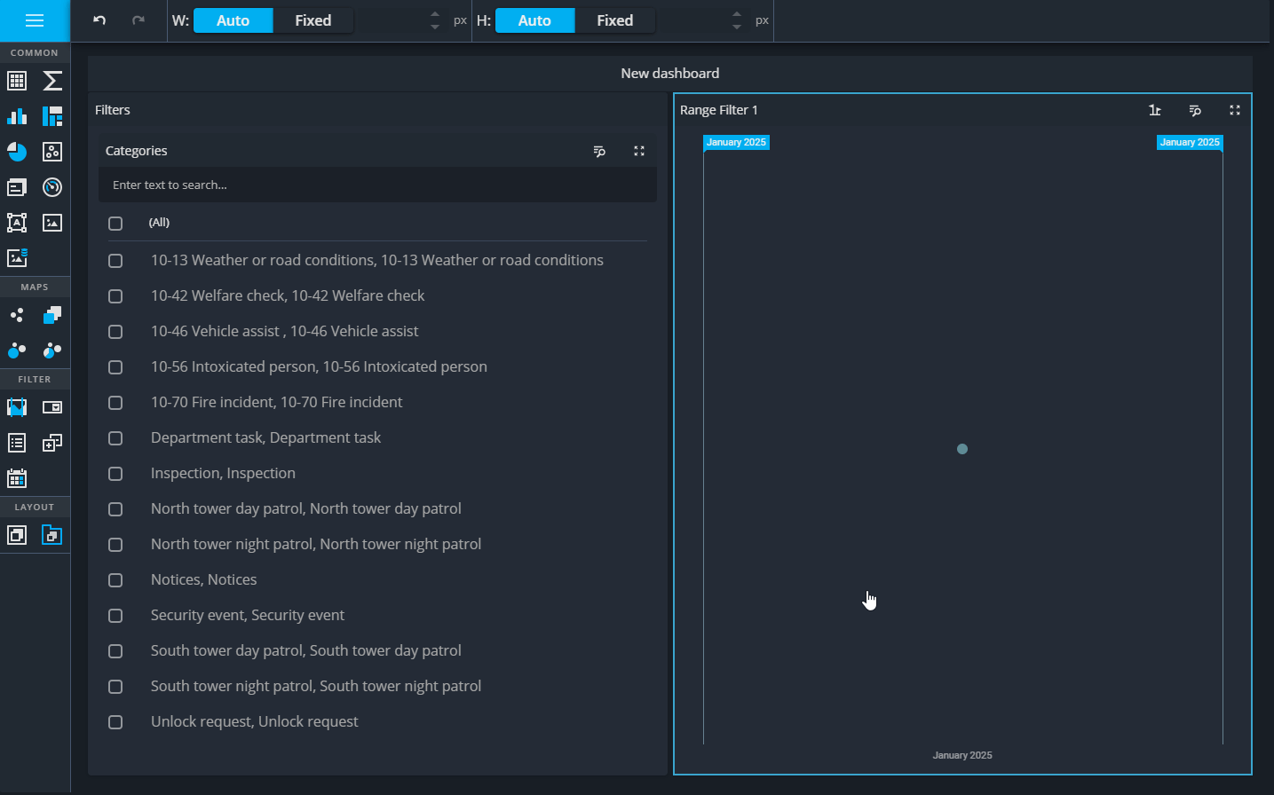
- Place it outside the Filters group created earlier this will split the dashboard into two equal halves and step lays the groundwork for adding more interactive filtering options.
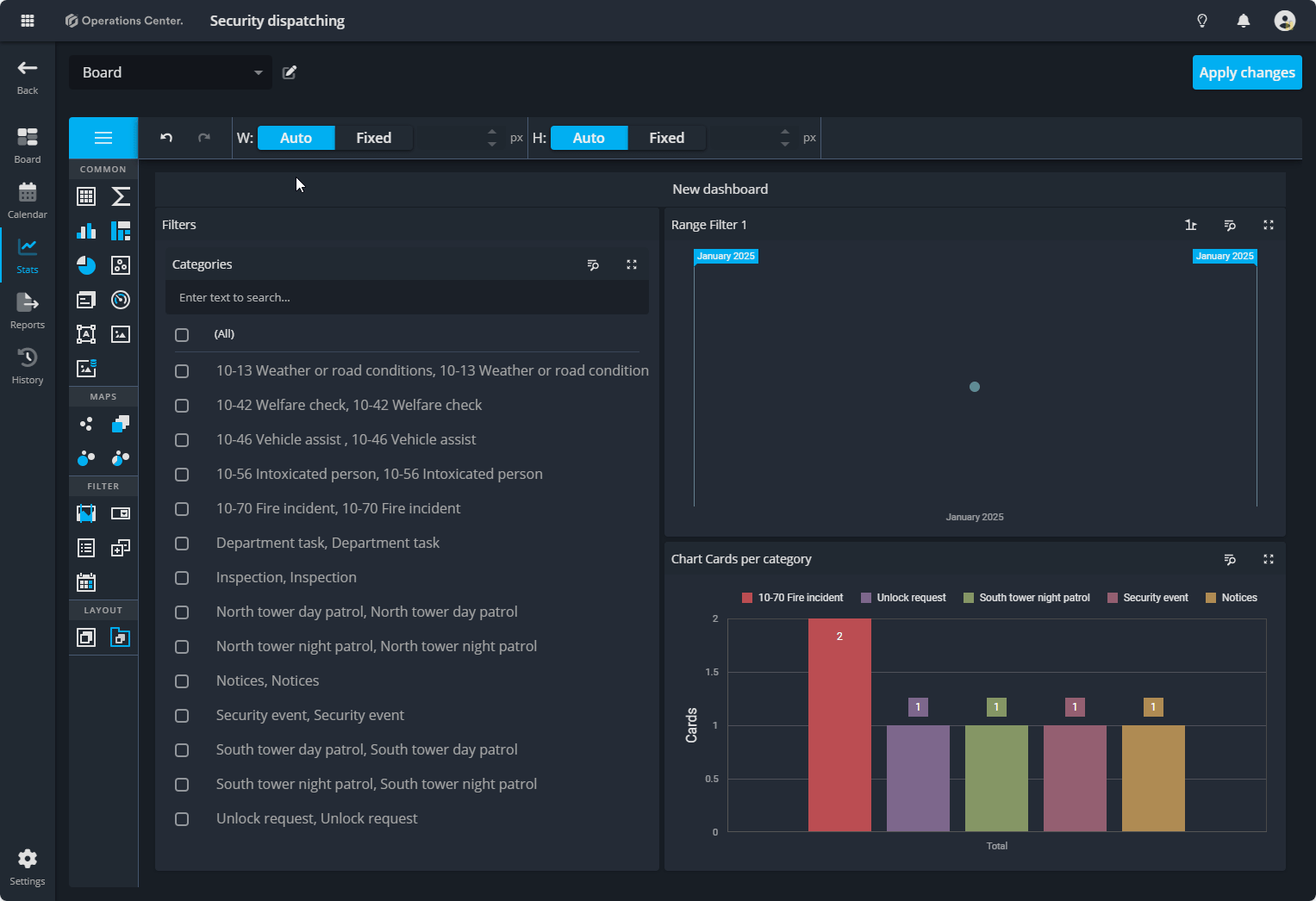
Configuring the Range Filter Widget for Card Activity by Date
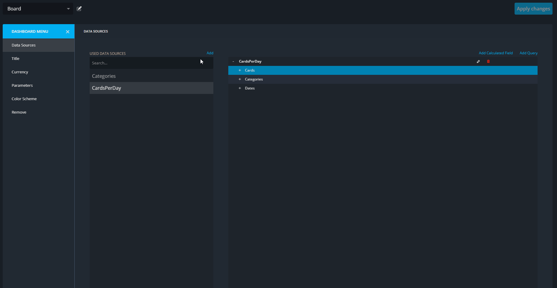
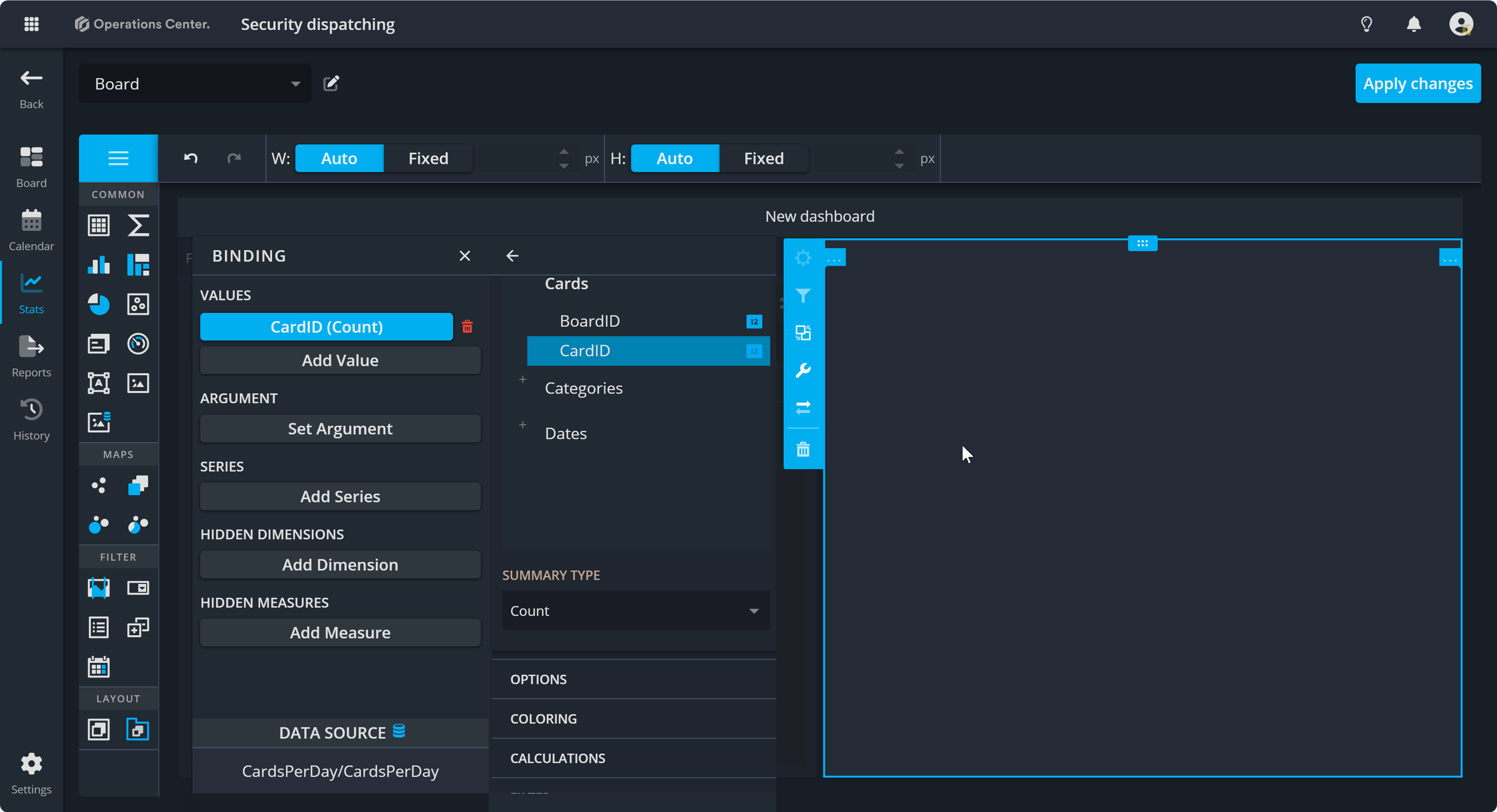
1. Bind Data Source
In this section, you will select the data source (CardsPerDay) to connect the widget to the relevant data. This step ensures the Range Filter Widget uses the correct query to display card activity by date.
Steps:
- Click on the Binding button to open the panel.
- Expand the Data Source section and navigate to the CardsPerDay query.
- Confirm the selection by clicking OK.
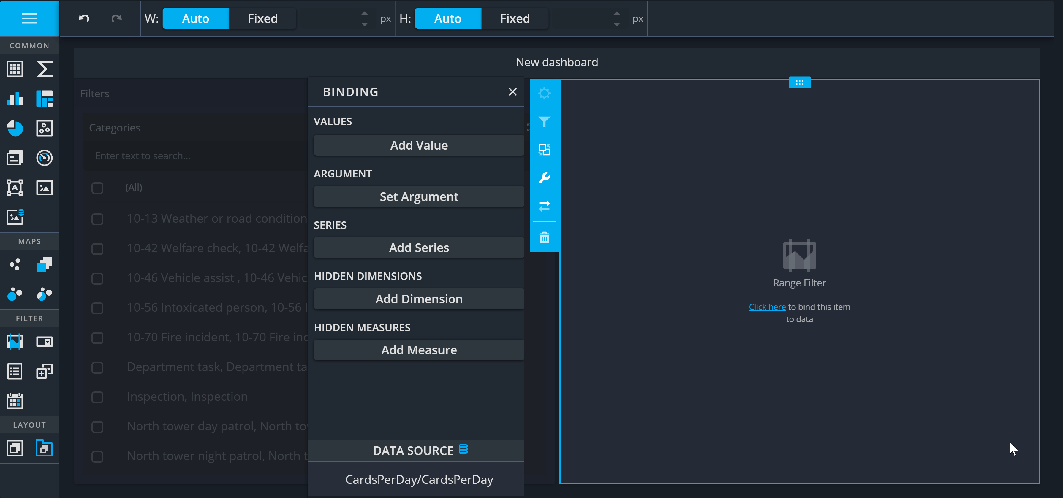
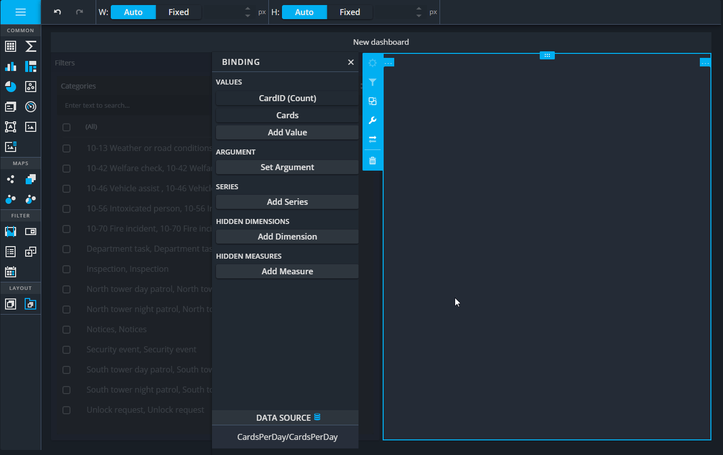
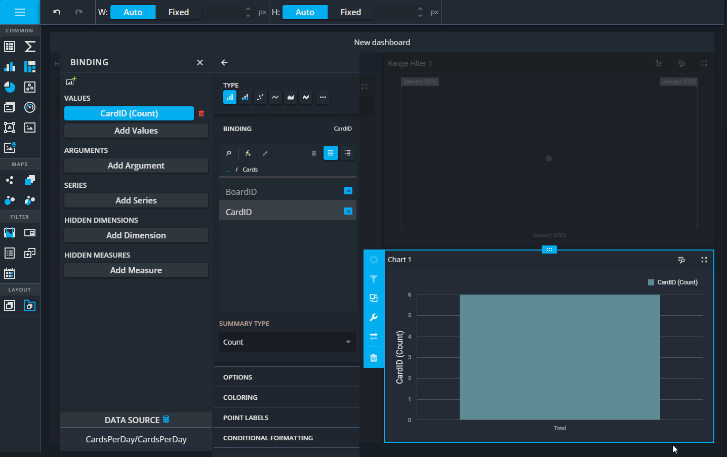
2. Add Values
Now you need to adding the CardId field as the value to be displayed and setting its type and aggregation. This defines what the widget will measure—in this case, counting the number of cards created.
Steps:
- Under the Values property, click Add Value to open a sub-panel.
- Set the Type to Line (to visualize the data as a line graph).
- Expand Cards and select CardId.
- Set the Summary Type to Count (to count the number of cards).
3. Customize Options
Adjust the widget’s visual options to make it more user-friendly. Setting a clear caption and enabling point markers make the graph easier to read and interpret.
Steps:
- Expand the Options section in the sub-panel.
- Set the Caption to Cards (to label the graph appropriately).
- Turn Show Point Markers ON (to highlight data points on the graph).
- Close the sub-panel using the small arrow.
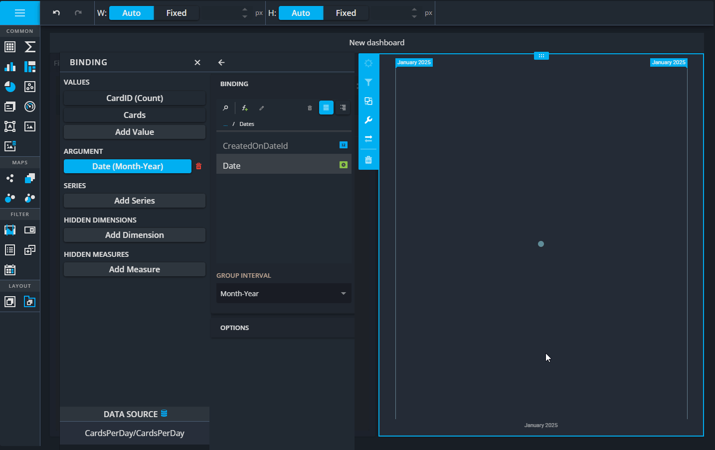
4. Set Arguments
Configure how the date field is grouped and displayed on the graph. Grouping dates by month-year provides a clear timeline for analyzing card activity trends.
Steps:
- Click Set Argument to open the sub-panel.
- Expand the Dates table and select the Date column. (Note: 💡If you do now see the date table, you can use the three dots to go back to the menu where you have all three Cards, Categories, and Dates option.)
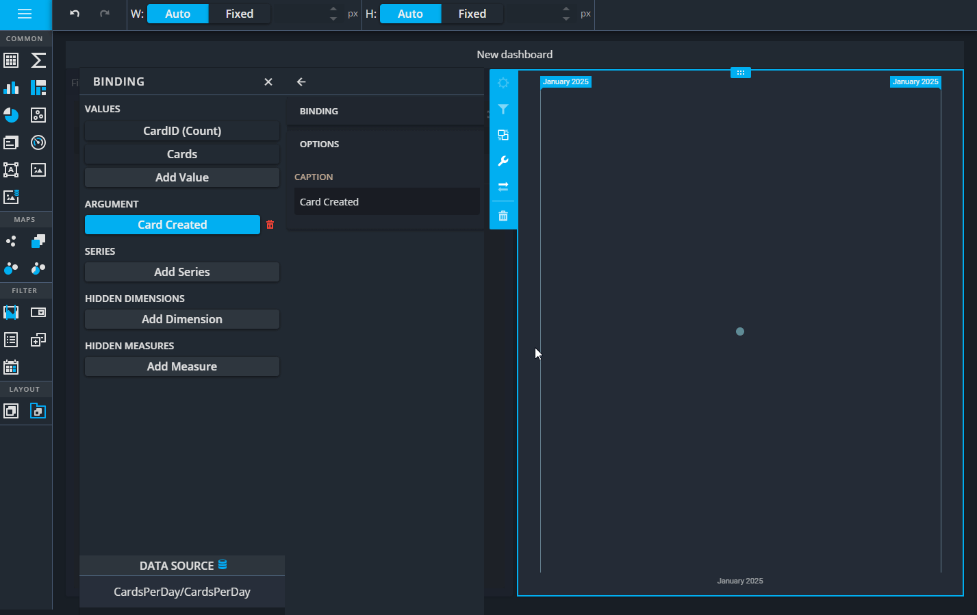
- Set the Group Interval to Month-Year (to group data by months).
- Expand Options and set the Caption to Card Created (to label the date axis).
- Close the sub-panel using the small arrow.
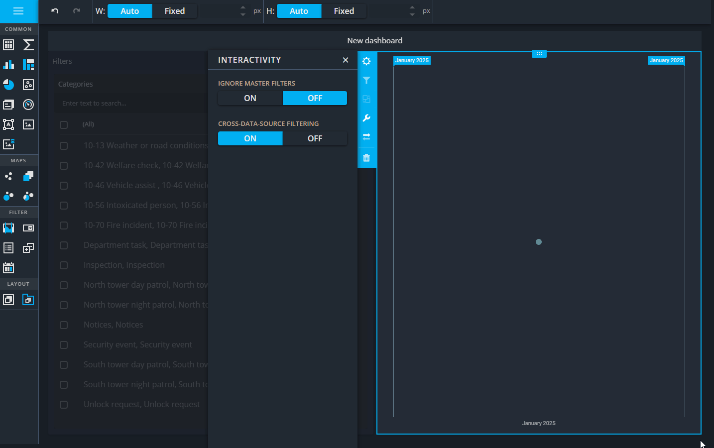
5. Adjust Interactivity
Configure interactivity settings to make the widget respond to filters applied elsewhere on the dashboard.This enables cross-widget filtering so this widget updates dynamically based on other filters, like category selection.
Steps:
- Click on the Interactivity button to open the panel.
- Turn Ignore Master Filters OFF (so this widget responds to the List Box filter).
- Enable Cross-Data-Source Filtering (to apply filtering across different queries).
- Open the options and Turn Show Caption ON and set the Caption to Cards Created (to give the widget a clear title).
- Close the panel.
What You’ve Achieved
After completing these steps, the Range Filter Widget:
- Displays card activity trends grouped by month-year.
- Dynamically updates when other filters (like categories) are applied.
- Helps users analyze data trends over time with visual clarity and precision.
Add a Chart Widget to Display Cards Per Category
Adding a Chart widget to your dashboard to visualize the distribution of cards across categories.
Why it matters:
Charts provide a clear, visual breakdown of data. This widget will give users an overview of how cards are distributed across different categories, helping identify trends or areas of focus.
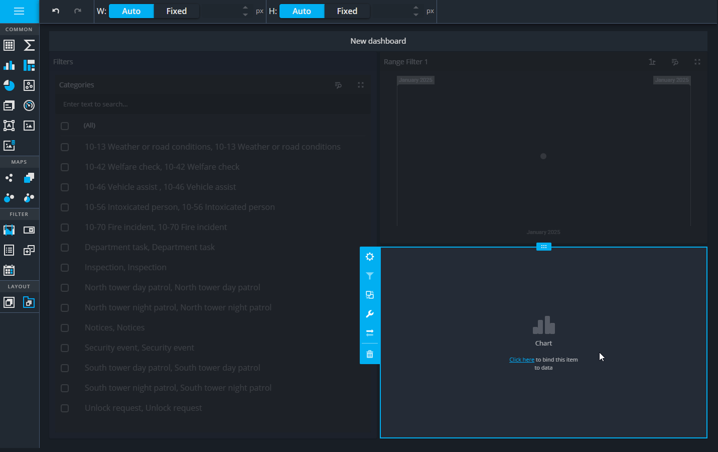
1. Add the widget
Click and drag the Chart widget below the Range Filter.
💡 Pay attention to the blue line indicating where the widget will be placed. Ensure it’s below the Range Filter, not within the Filters group
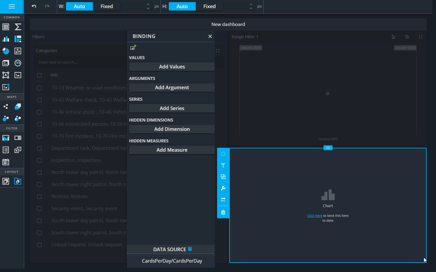
2. Open the Data Source panel:
- Click the Options button to open the configuration panel.
- Expand the Data Source section.
- Click the 3 dots to navigate up the data sources and select the CardsPerDay query.
- Click OK to apply and close the Data Source section.
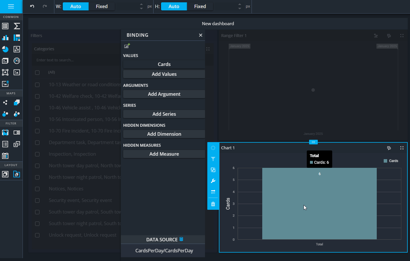
3. Configure the chart’s values:
- Under Values, click Add Value.
- Select Bar as the visualization type.
- Expand Cards and select the CardId field.
- Set the Summary Type to Count.
4. Customize value options:
- Expand the Options section.
- Set the Caption to "Cards."
- Expand Point Labels:
- Check the Value box.
- Set Overlapping Mode to None.
- Expand Format:
- Set Format Type to Number.
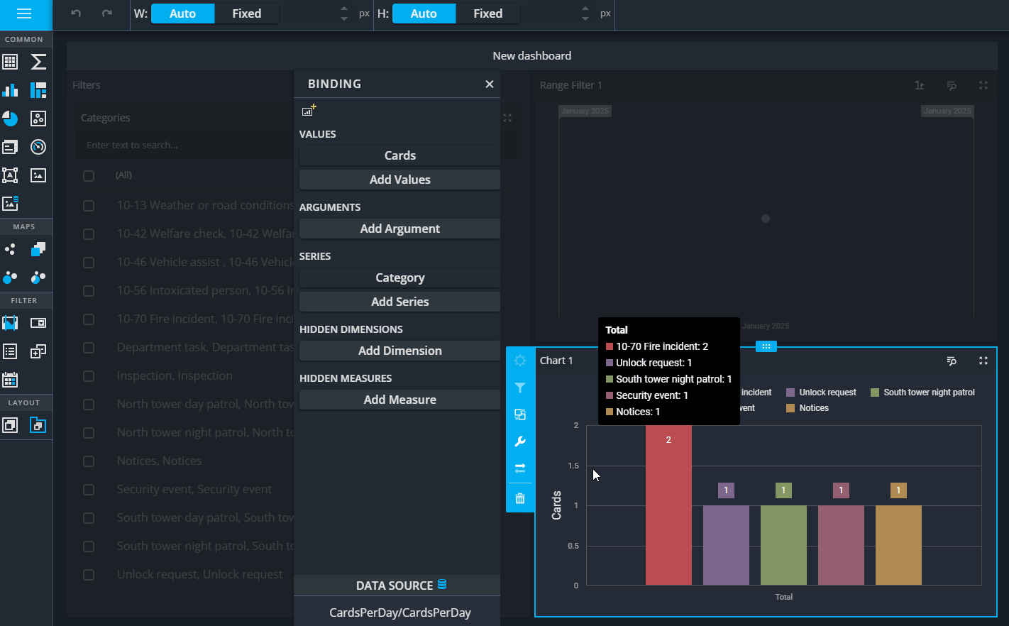
Add a series to categorize data:
- Under Series, click Add Series.
- Expand Categories and select the CategoryTitle column.
- Open the Options section:
- Set the Caption to "Category."
- Expand the Top N section:
- Enable Top N by setting Enabled to ON.
- Set Count to 7 (displaying the top 7 categories).
Finalize the chart configuration:
- Click on the Options button again.
- Set the Caption to Cards per Category.
- Close the panel by clicking the Close button.
- Resize the Filters group to make the chart widget more visible by dragging the edges as needed.
Save and exit:
- Click Save at the top to save changes.
- Use the Switch Mode icon to leave the dashboard designer and test the new widget.